When Women Of Worth, a long-term client of over 10 years, launched GO TO SCHOOL, FEARLESS!—a critical initiative designed to raise awareness about recognizing, preventing, and responding to Child Sexual Abuse (CSA) in schools and learning centers—they needed a strong visual and communication strategy. The initiative, known as The Fearless Project, empowers institutions to foster a culture of safety, ensuring the well-being of both girls and boys on campus and in online learning environments.
Despite the growing need for CSA awareness, many educational institutions struggle with inadequate resources and preparedness. The Fearless Project directly addresses this gap by equipping decision-makers—including board members, principals, and educators—with the knowledge and tools necessary to create safer learning spaces.
The Task
WOW needed a compelling and cohesive brand identity for The Fearless Project that would:
✔ Establish credibility and trust within the education sector.
✔ Communicate urgency while maintaining sensitivity.
✔ Engage diverse audiences, from school management to teachers and students.
✔ Support multiple marketing channels, from social media to in-person presentations.
The organization required a complete visual and communication toolkit, including branding, marketing materials, and digital assets, to ensure maximum impact across various platforms.
Our Approach
At Creator Media, we understand the power of design in driving meaningful change. Our approach to The Fearless Project was rooted in clarity, engagement, and emotional resonance. We focused on creating a strong yet approachable identity that would reinforce trust and action.

1. Brand Development & Identity
We developed a bold, yet professional brand identity that aligned with WOW’s vision. This included:
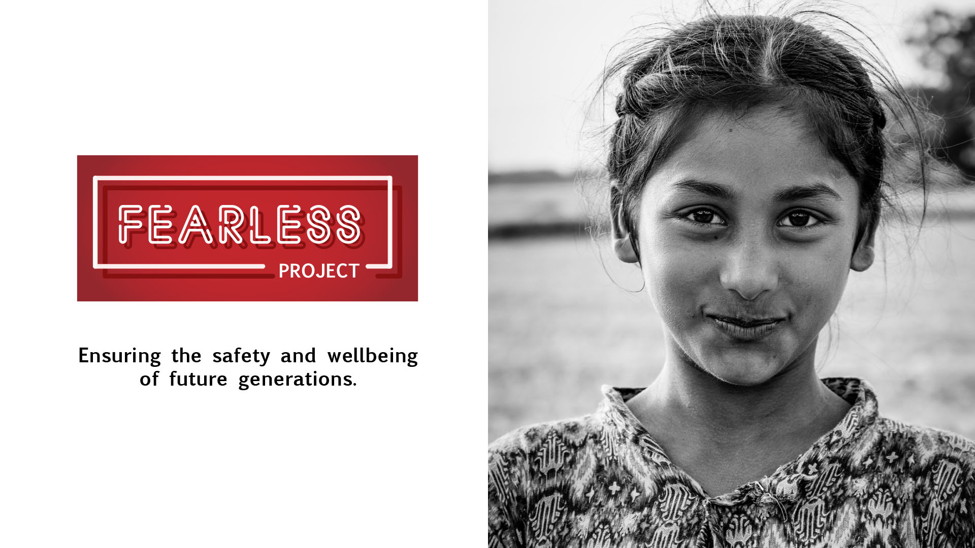
- A distinct logo – The Fearless Project logo features a strong, structured design with bold typography enclosed in a red frame, symbolizing protection, urgency, and empowerment. The solid block format conveys a sense of resilience and unwavering commitment to child safety.
- A powerful color palette – The use of red and black was intentional:
- Red evokes urgency, action, and the need for immediate attention to CSA awareness.
- Black adds a sense of authority, professionalism, and seriousness to the cause, ensuring the message is taken seriously across different audiences.
- Typography that was accessible and professional, ensuring clarity in communication.

2. Marketing & Awareness Materials
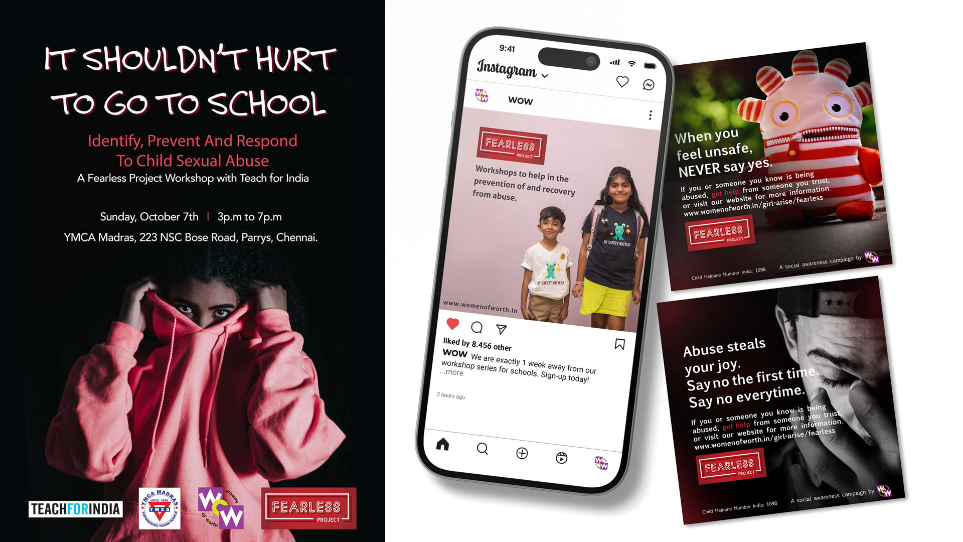
- Posters & Brochures – Informative, visually engaging, and easy to distribute.
- Presentation Deck Elements – Custom slides, infographics, and branded layouts for workshops.
- Social Media Content – Eye-catching visuals and message-driven posts to raise awareness online.
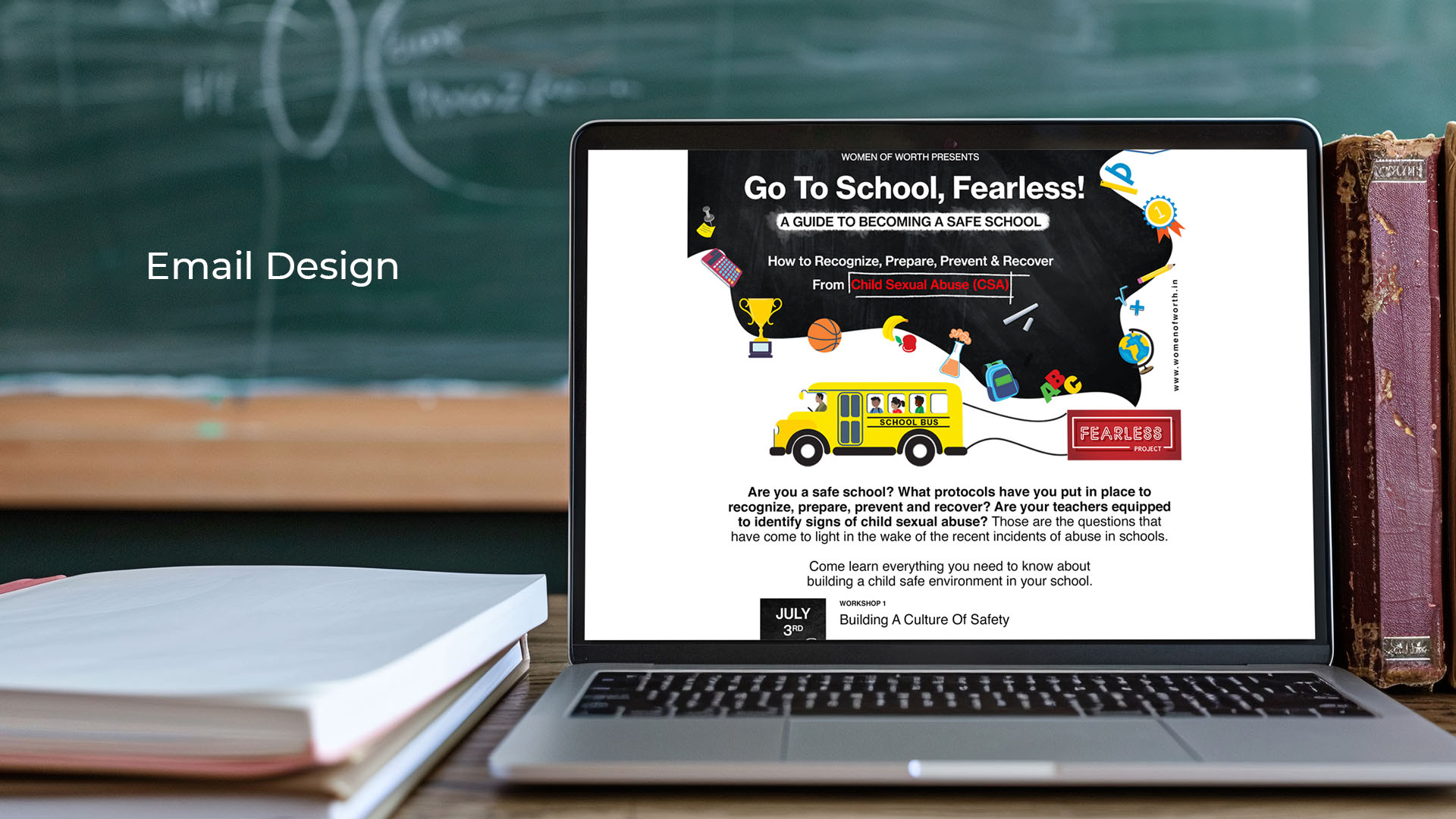
- Document Branding & Templates – Professional designs for reports, proposals, and guides.
- Custom Icons & Campaign Elements – Simplified visuals to aid quick understanding.
- Videos & Animations – Impactful storytelling elements for digital outreach.


3. Messaging & Content Design
We crafted messaging that was:
- Clear & Actionable – Avoiding jargon, ensuring accessibility for all stakeholders.
- Empathetic & Empowering – Balancing sensitivity with a call to action.
- Tailored for Different Audiences – Adapting tone and content for educators, students, and decision-makers.
The launch of The Fearless Project with a strong visual and strategic presence helped WOW gain immediate recognition and credibility among schools. Engagement in workshops increased, with more institutions expressing interest in participating. The branding and marketing materials streamlined their outreach efforts, ensuring seamless communication across digital and physical platforms. By providing compelling visual and content assets, The Fearless Project strengthened its advocacy for CSA awareness, making a tangible impact in school communities and reinforcing WOW’s position as a leader in child safety initiatives.

Get the 360° Design & Branding Experience!
Your brand is a story waiting to be told. From bold branding and seamless web design to striking graphics and game-changing strategy, we craft with purpose. We can bring your vision to life!


